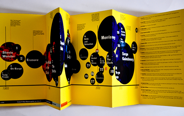
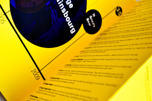
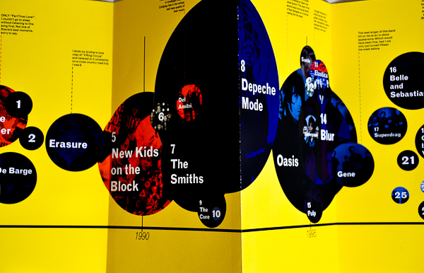
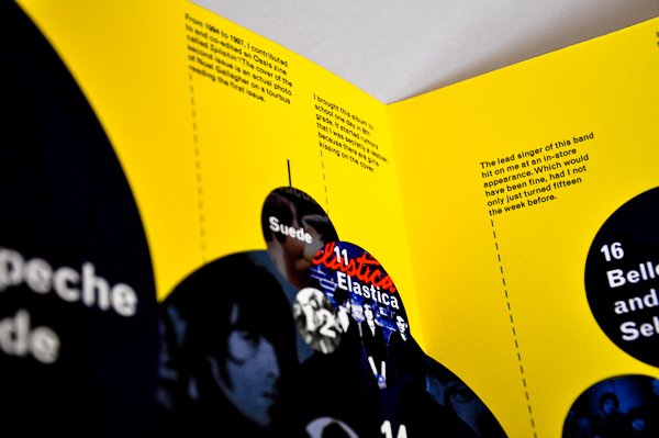
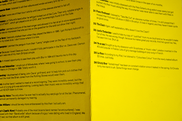
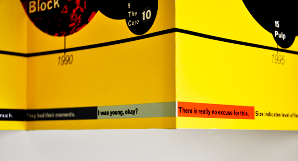
Yes, this was a student project, if you were wondering. However, it's one of my favorite pieces of design I've ever made, period. The prompt was just to make an infographic of any kind of data.
This is a funny little work in progress.
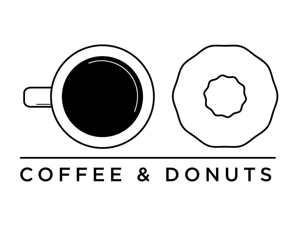
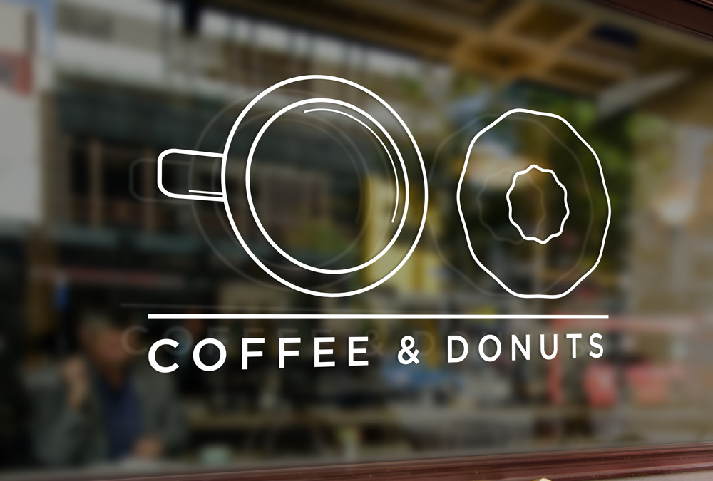
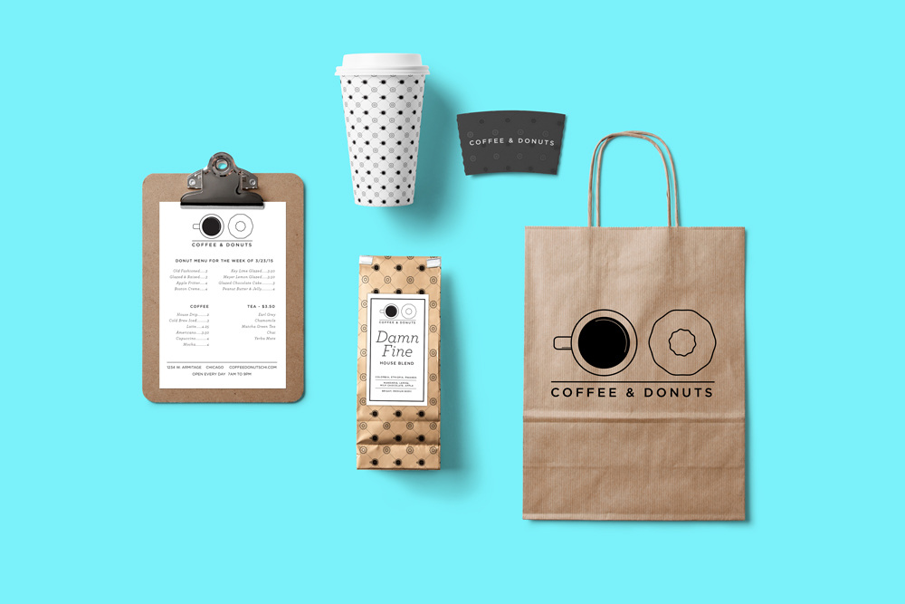
Several years ago, back when Parson's Chicken and Fish in the Logan Square neighborhood of Chicago was a long-abandoned Dairy Queen, I wondered what would ever open in its place. There were only one or two coffee shops in the neighborhood at the time, so what if it was a cafe and donut shop? What started out as riffing between friends became a logo and branding exploration. I'm still surprised Logan Square doesn't have a donut shop yet. I’m still messing about with an online shop setup, so that’s next.
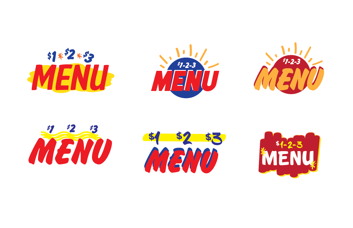
Another project I worked on while at the Marketing Store was developing some concepts for a refresh of their $1-2-3 Menu program. I took this as an opportunity to incorporate the influence of handpainted grocery signage - informative, full of personality, and the opposite of snobby.

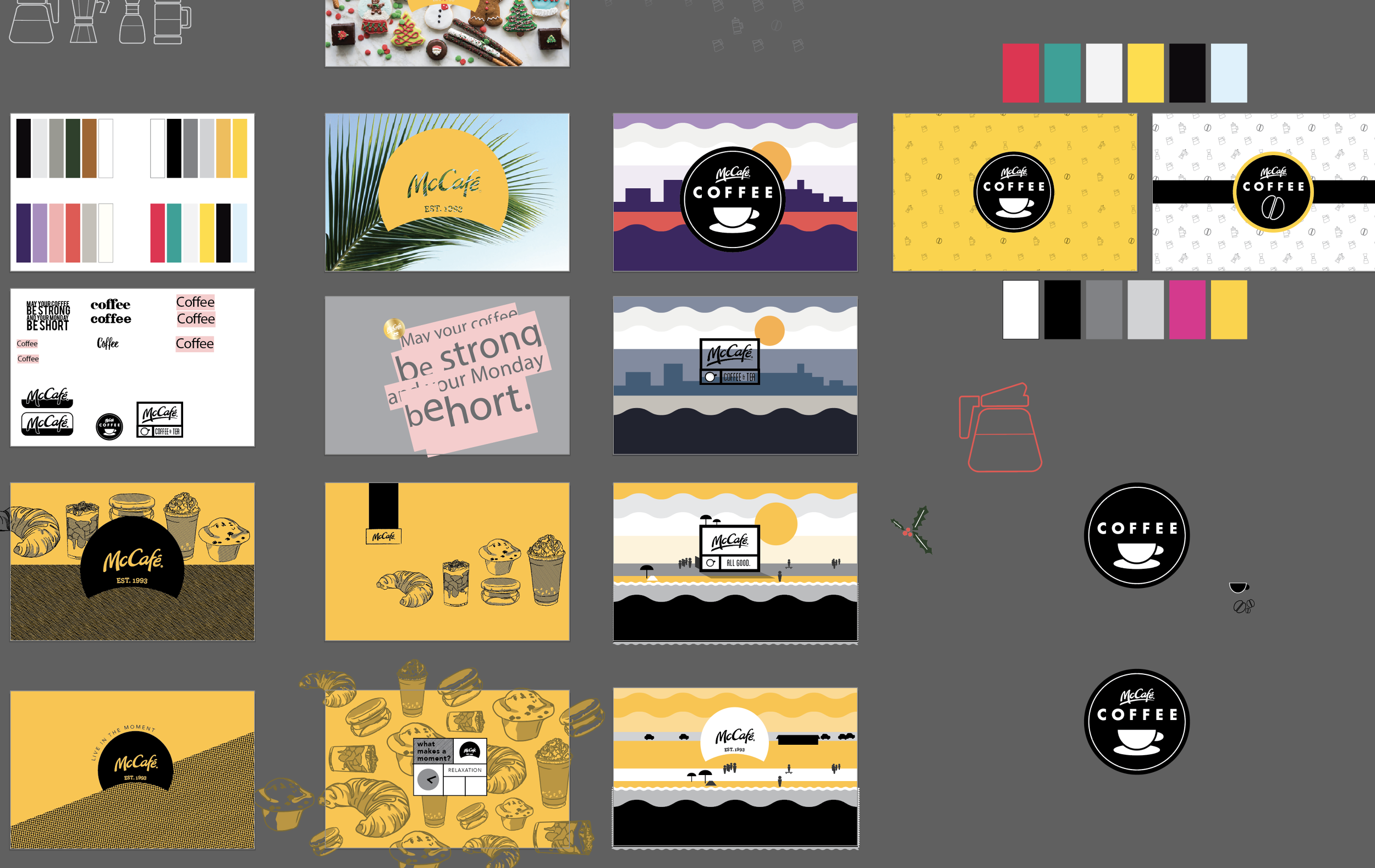
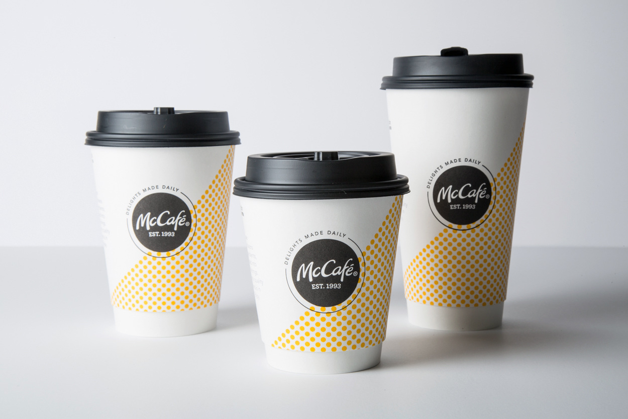
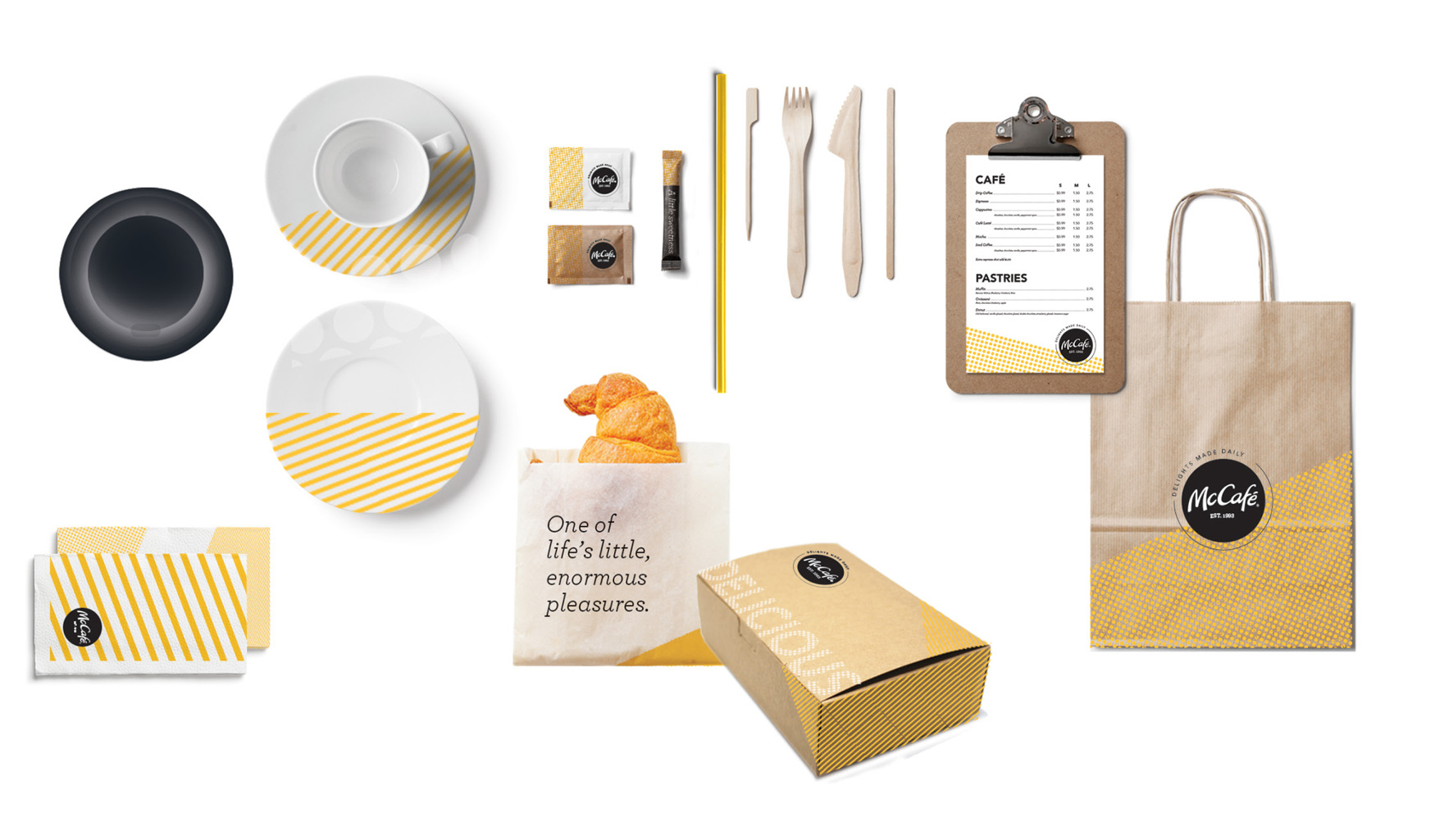
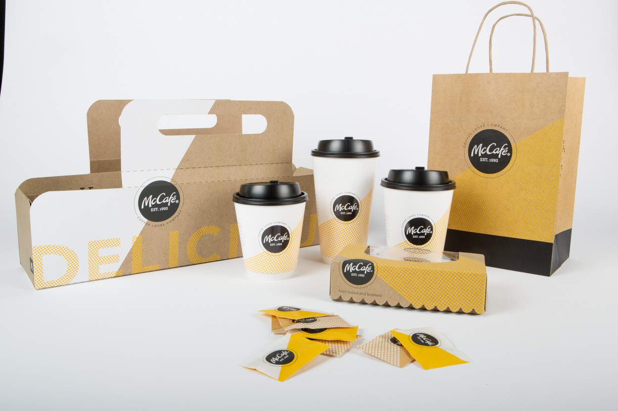
I had the honor of working on the redesign of McDonald's McCafe brand and packaging, which launched in September 2017 and ran for about a year. What started as Pinterest and mood boards, turned into a mess of iterations, refinements, and ultimately an updated, modern look and feel for McCafe.
In 2018, I completed the General Assembly visual design course, in order to to brush up on digital best practices and go more in-depth on designing a site from the ground up. This is the landing page for a fictional streaming music service, BEAT.BOX, which mines daily activities like step count, exercise logging, location check-ins and image geotagging to build custom playlists for individual users.
Looking at it now, as someone who’s learned even more about best practices and accessibility concerns firsthand, there is so much room for improvement that I’m probably going to revisit this soon.


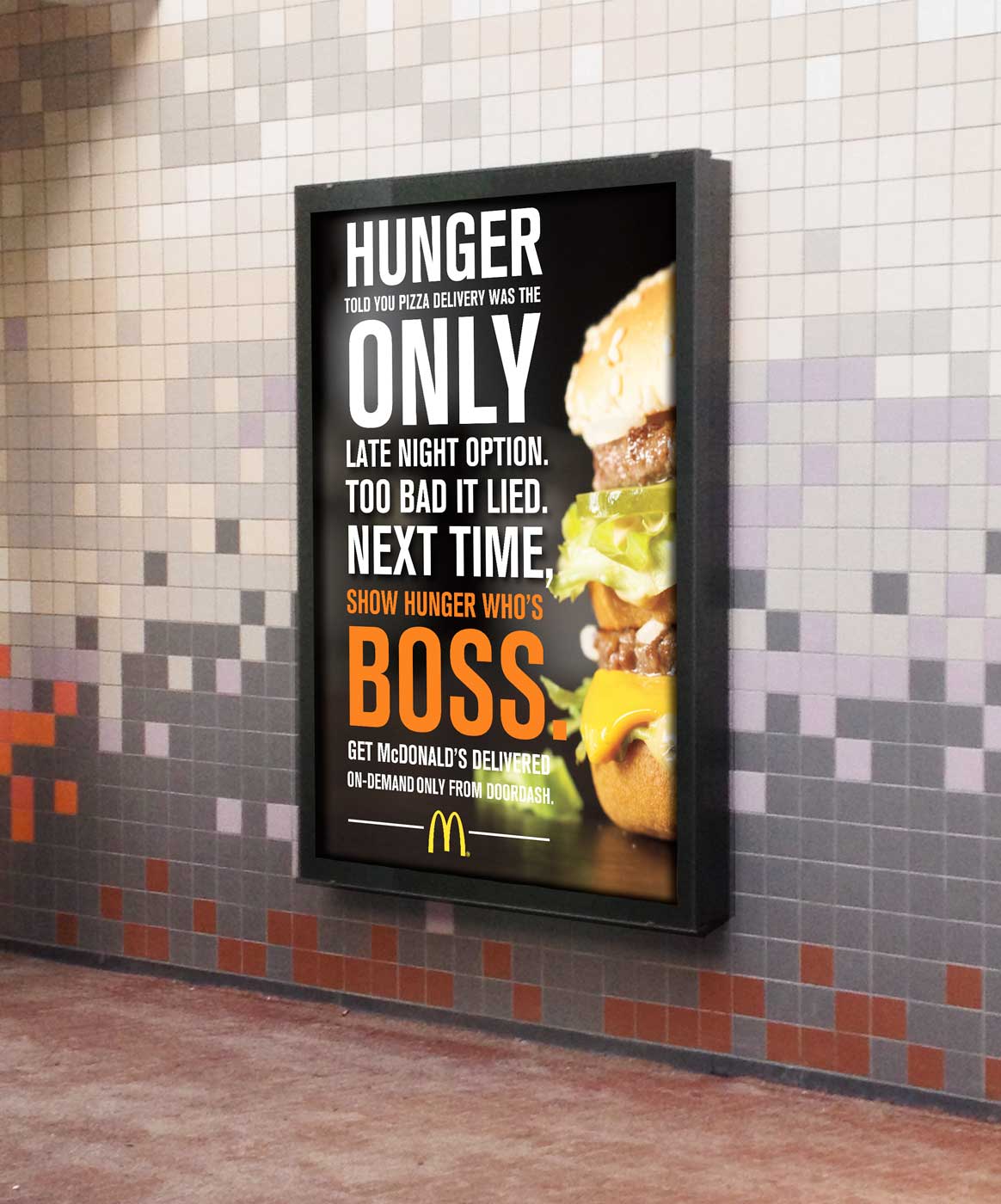
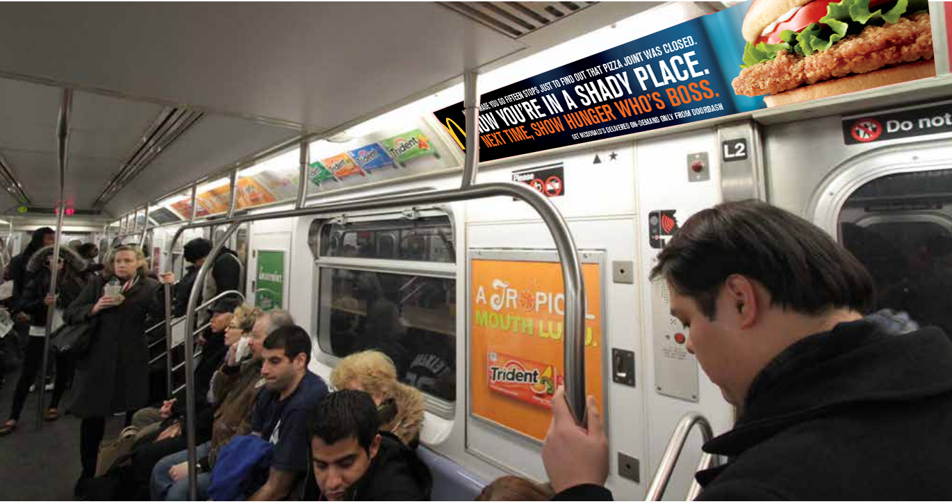
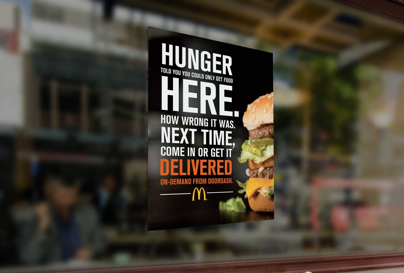
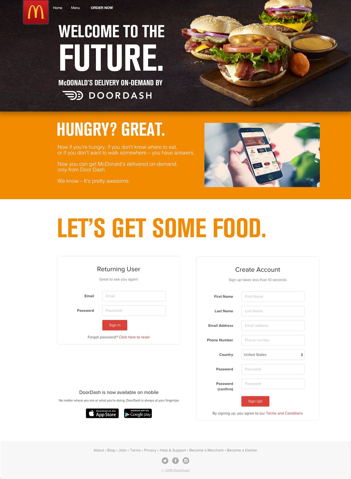
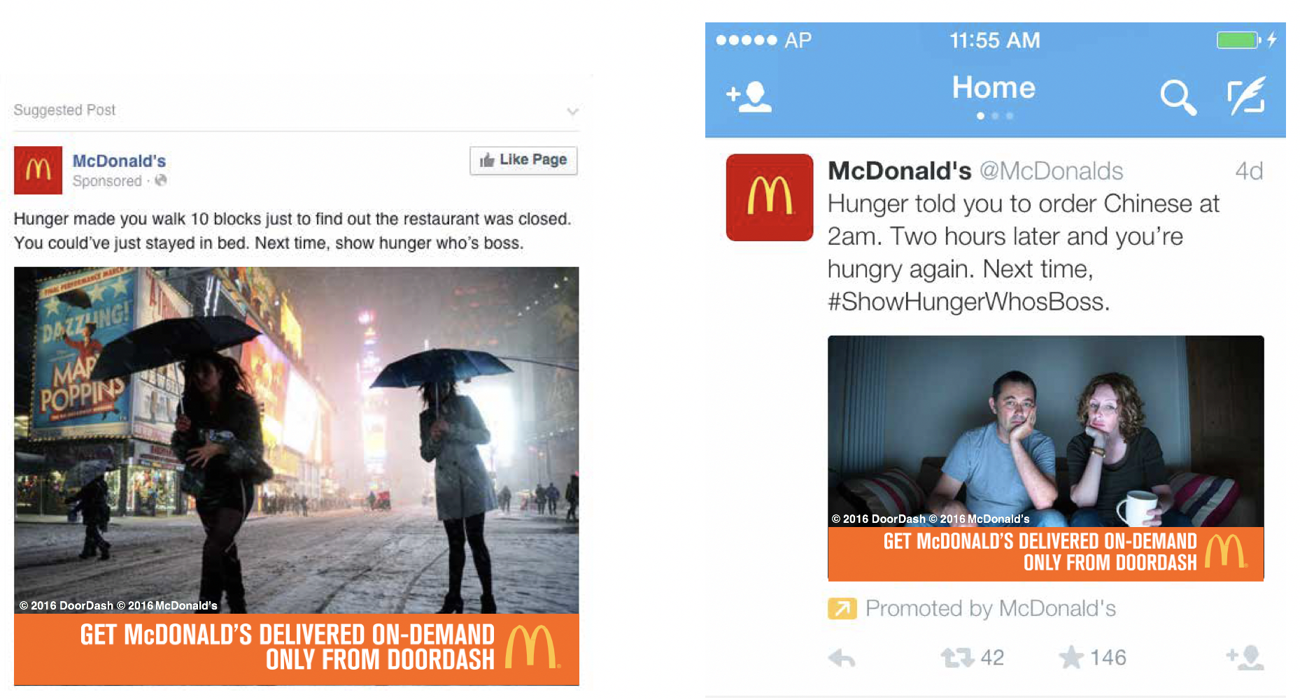
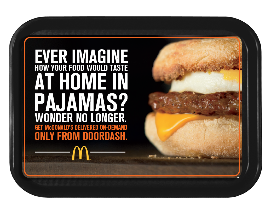
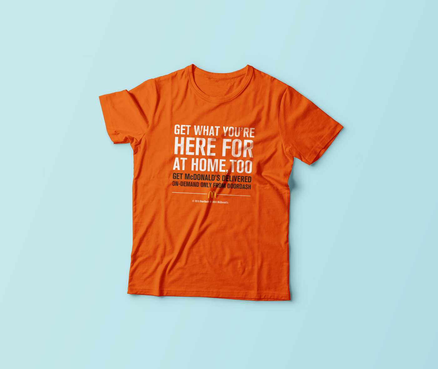
Concepts pitched to McDonald’s for a millennial-friendly delivery service in New York City.